Thinkbrand
A Guide to Immersive Storytelling
Google Canada needed an onbrand web solution to build a closer relationship with Canadian marketers and agencies. They had been doing individual workshops with teams, and invited CEO’ during a 2013 event called ‘Think Insights’. To extend their reach and drive engagement with agencies and marketers they executed a Toronto based week-long conference – Google Think Brand Week.
Simplicity in Motion
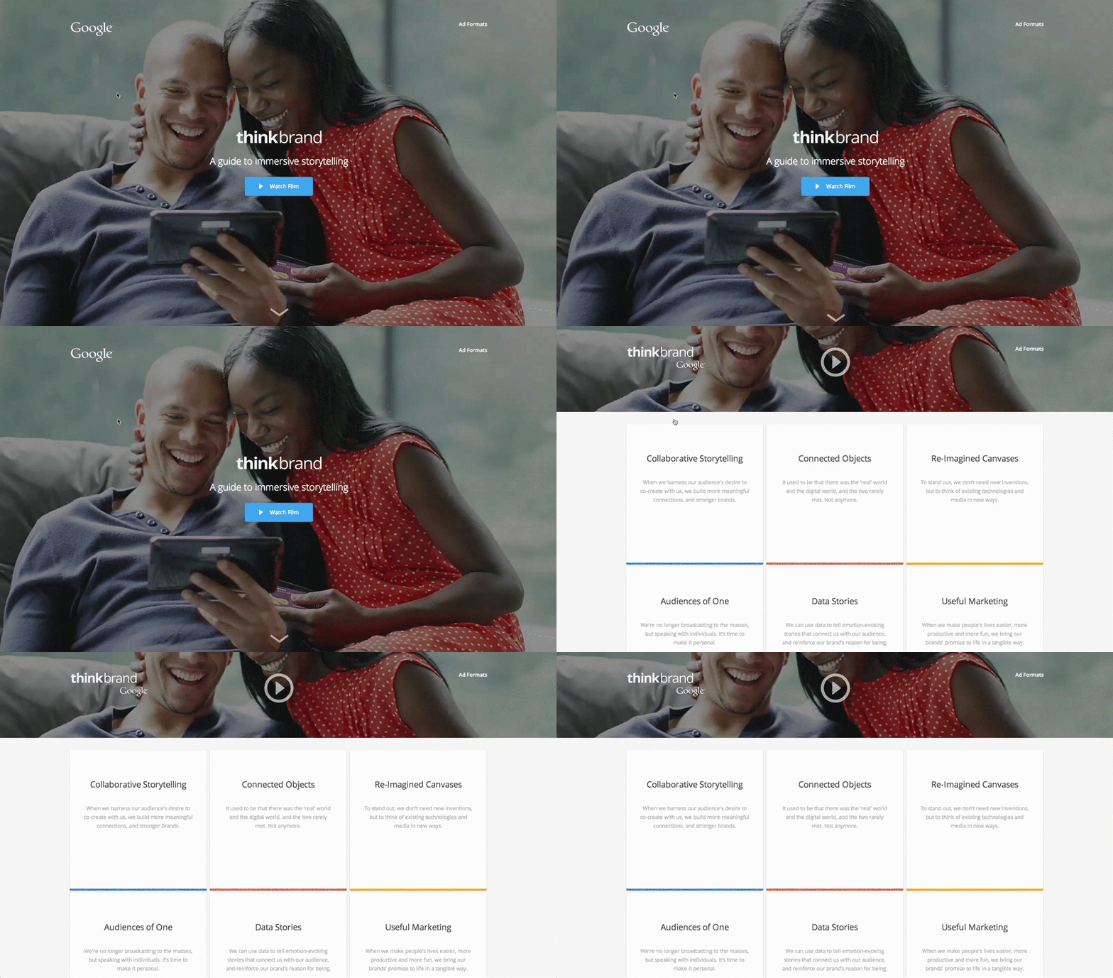
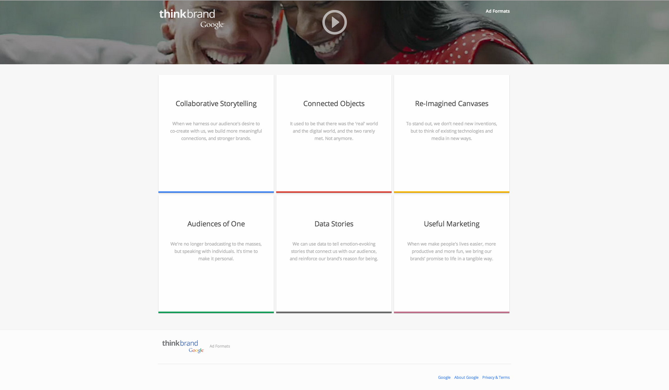
When the user hovers over each action item they rise off the page and display a call to action to the user.
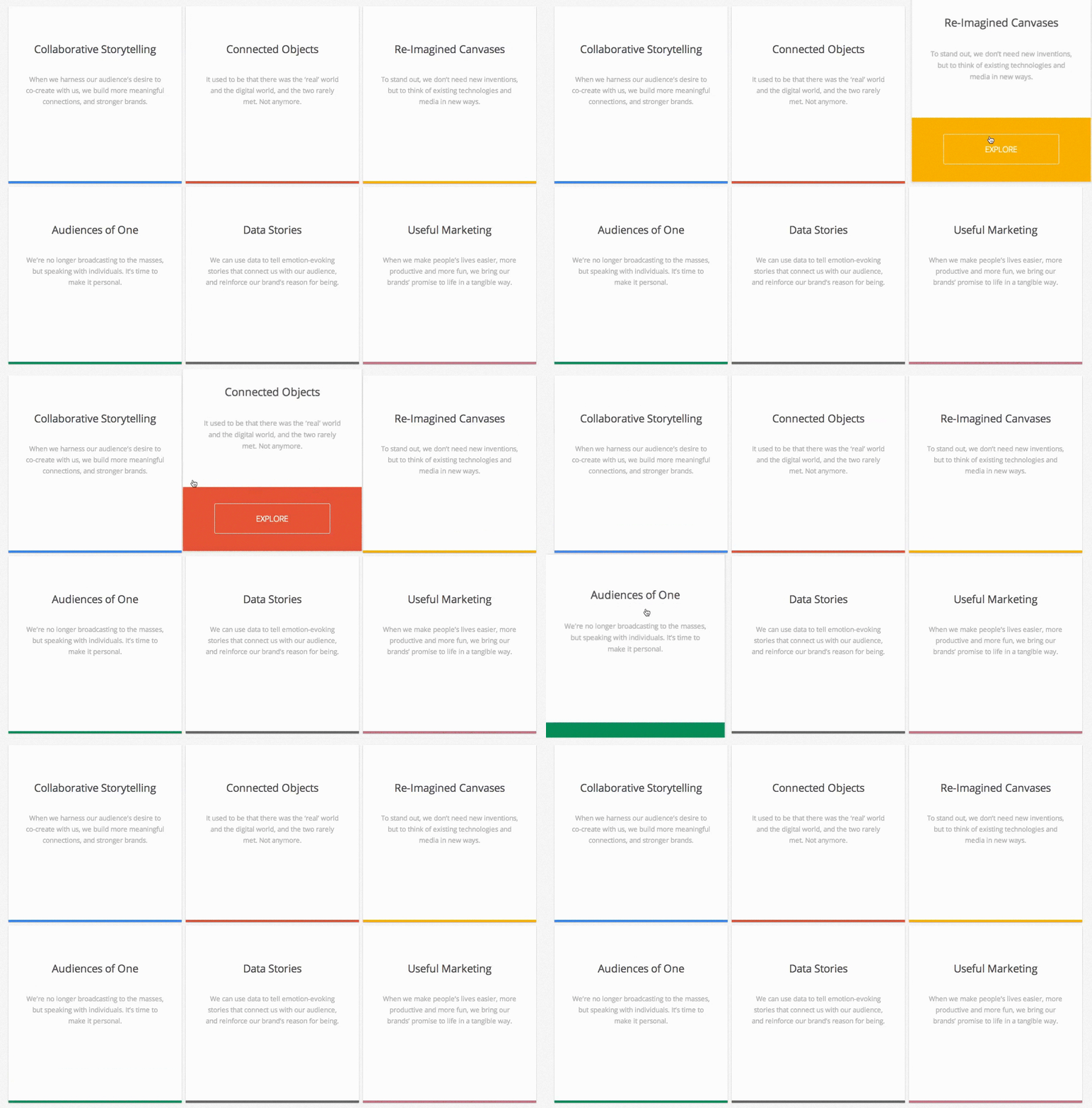
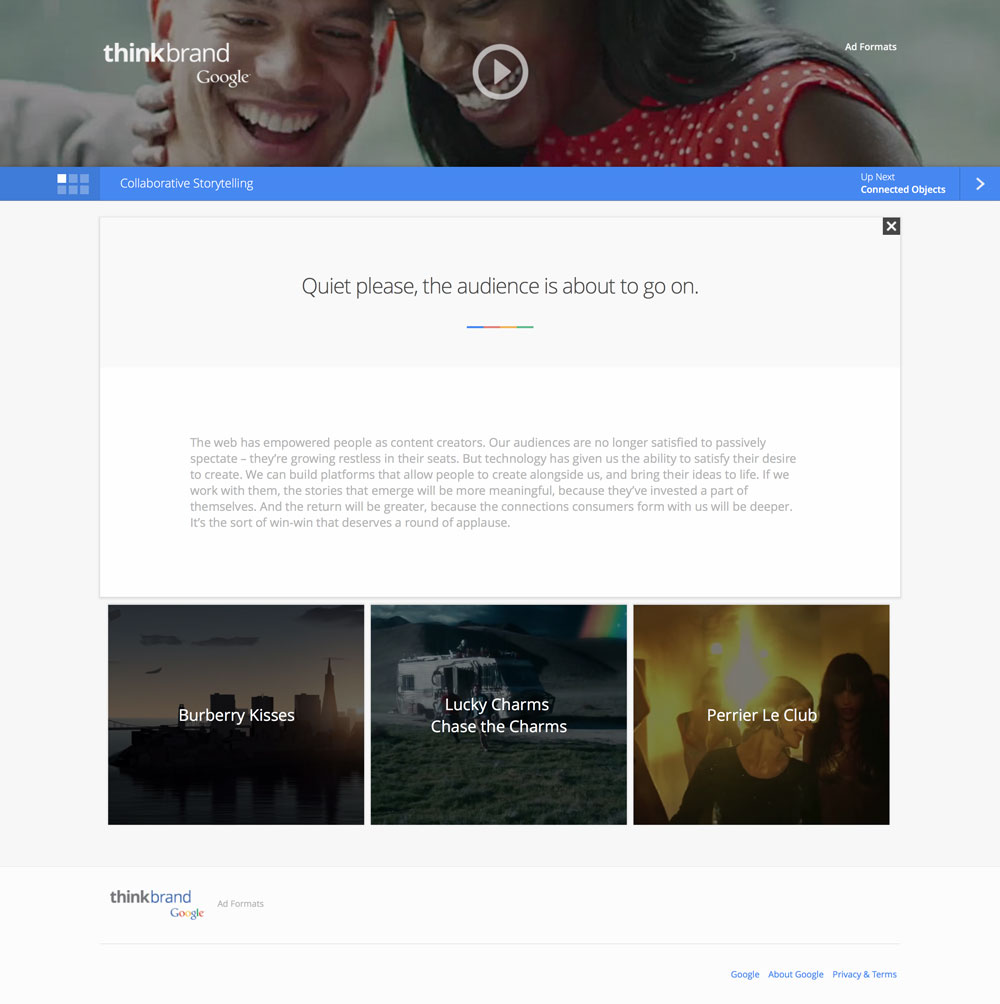
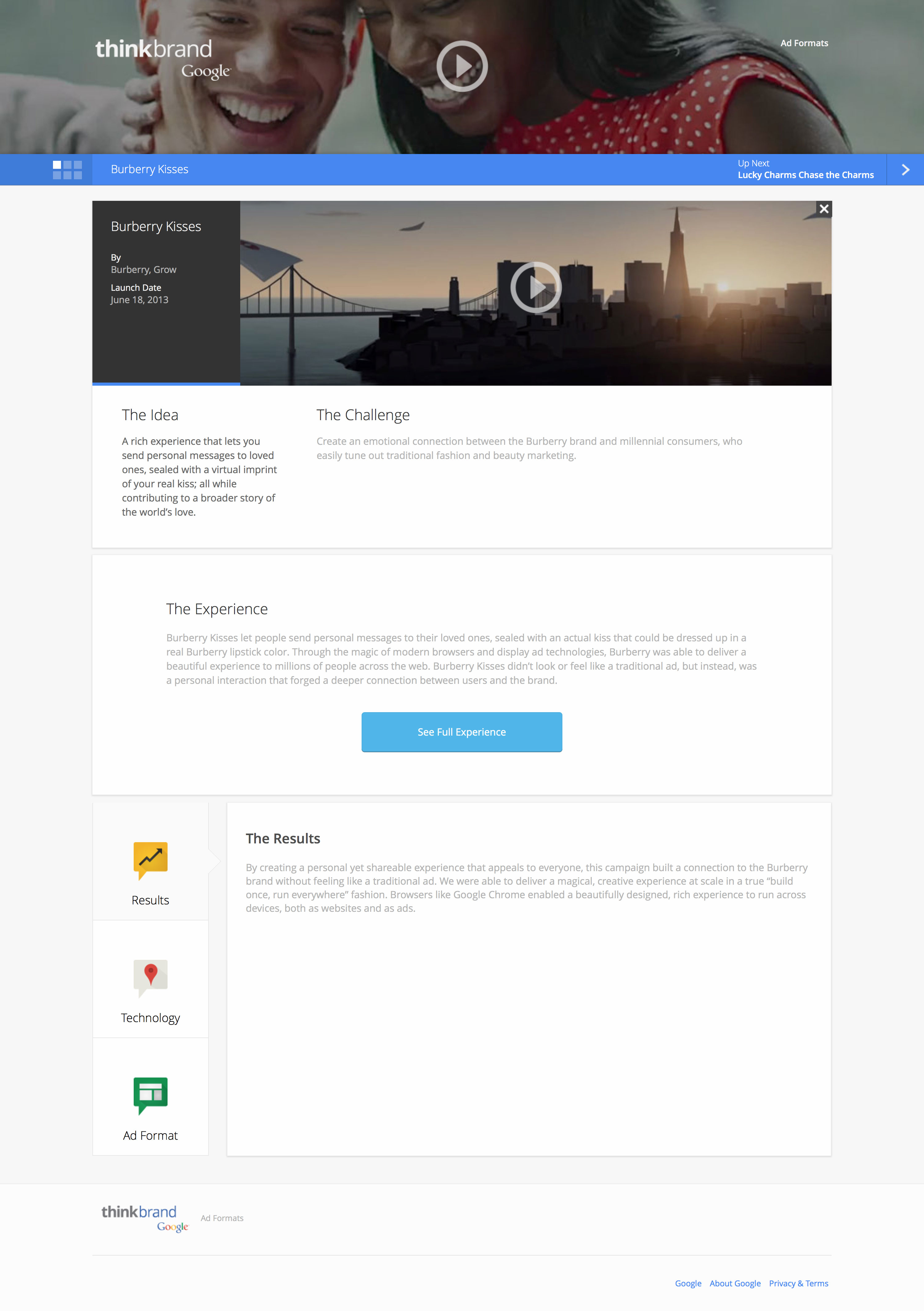
We wanted the user to have a seemless experience, with the interfaces chaning to the users navigation needs. That’s why, when the user selects a card from the home page, we get a direct correlation from the item clicked to the new content displayed.
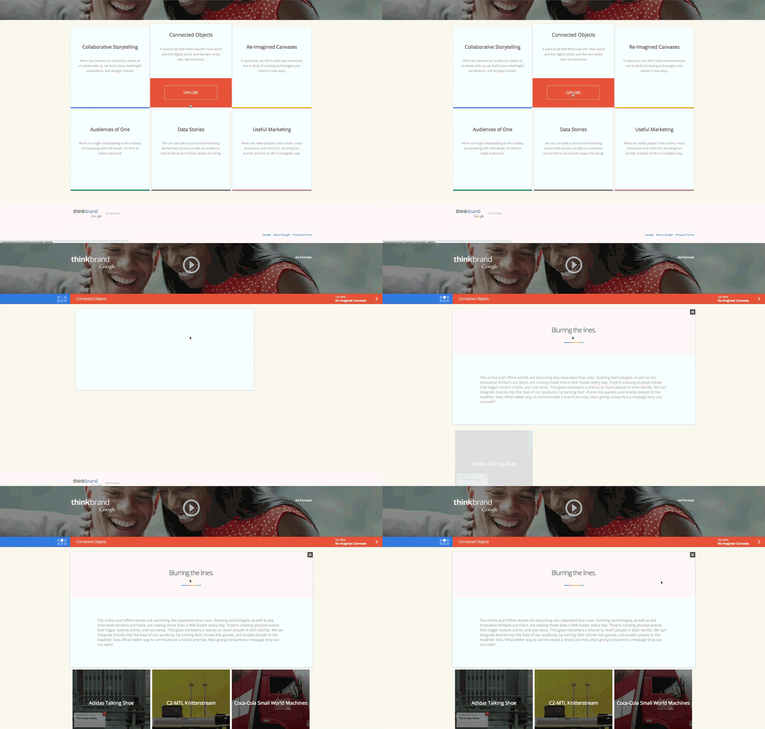
Navigating through the different card levels was very important to us. We did not want users to have to back out to explore another topic and we also wanted the user to have an understanding where they were at all times. The navigation we came up with shows which of the six cards they are currently exploring, and provides additional feedback by blinking when the user changes cards. In addition the bar changes colors based on the colors assigned to each topic and it is accessible using mobile gestures and keyboard commands.

In the spirit of keeping the experience fluid, rather then building a lightbox when the user selected a video, we manipulated the content bringing back the idea of direct correlation.
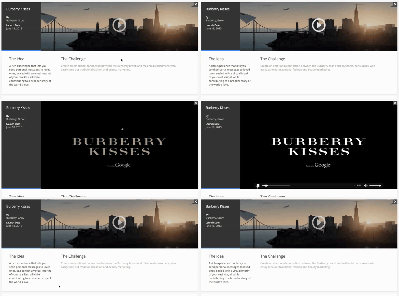
Desktop Experience
Mobile Experience


